
Our work with Rhodes Branding helped us clearly define who we are and how we present ourselves as a district. The final brand honors our community while keeping students at the center of everything we do.
Brand development for a community-centered Florida district

Located in South Florida, Okeechobee County Schools serves students across 12 schools in a close-knit community known for its strong sense of belonging and generational pride. District leadership partnered with Rhodes Branding to modernize and unify the district’s visual identity, ensuring the brand clearly reflected its commitment to students while honoring the community that surrounds them.
Storyline
The partnership began with a comprehensive research and discovery phase, including stakeholder surveys, interviews, focus groups, and a Brand Immersion Workshop. Feedback consistently highlighted Okeechobee’s strengths: safe schools, personalized relationships, long-tenured educators, and a small-town environment where students are known and supported.
Rhodes Branding developed a brand strategy centered on opportunity, belonging, and empowerment. The creative direction aimed to blend Okeechobee’s small-town character with forward-thinking momentum.
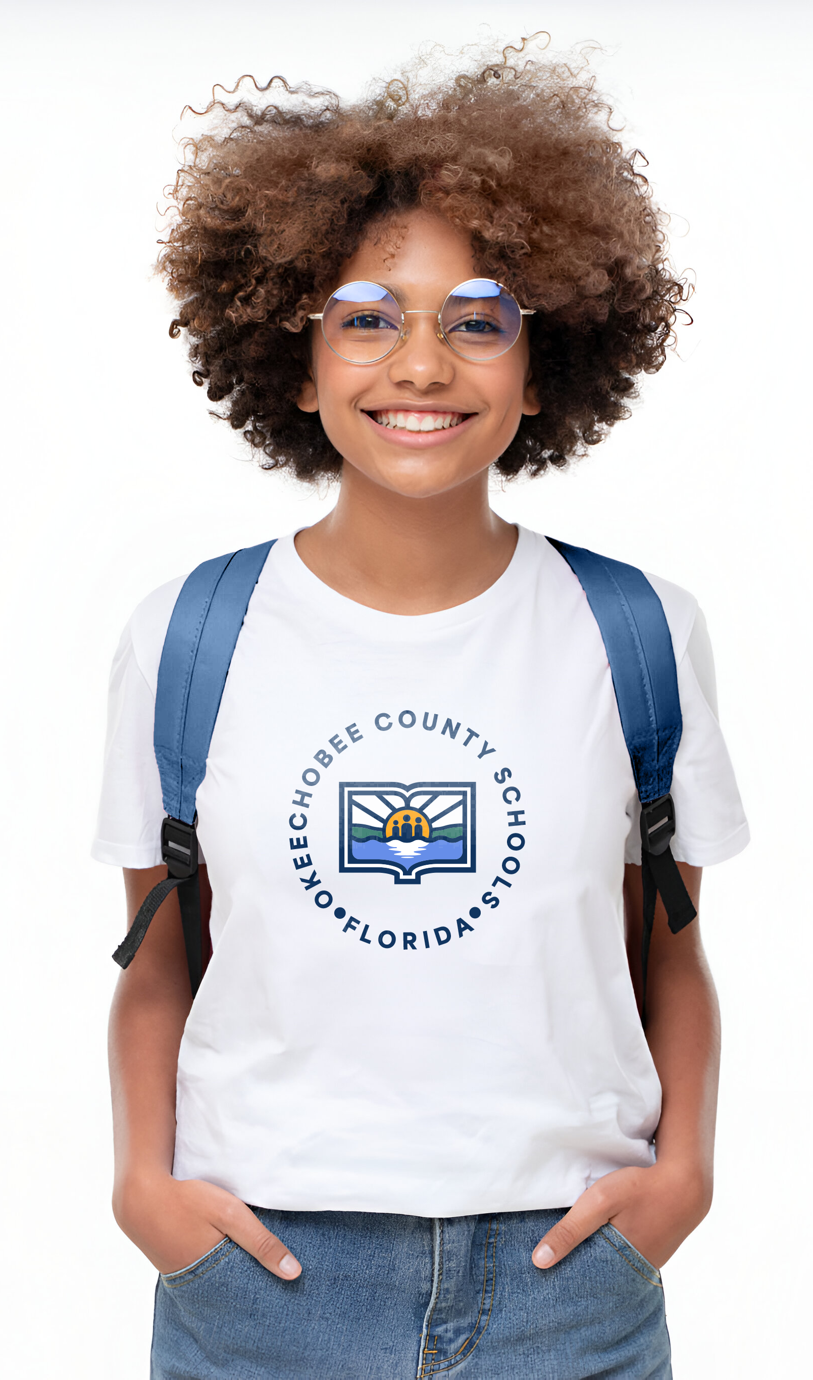
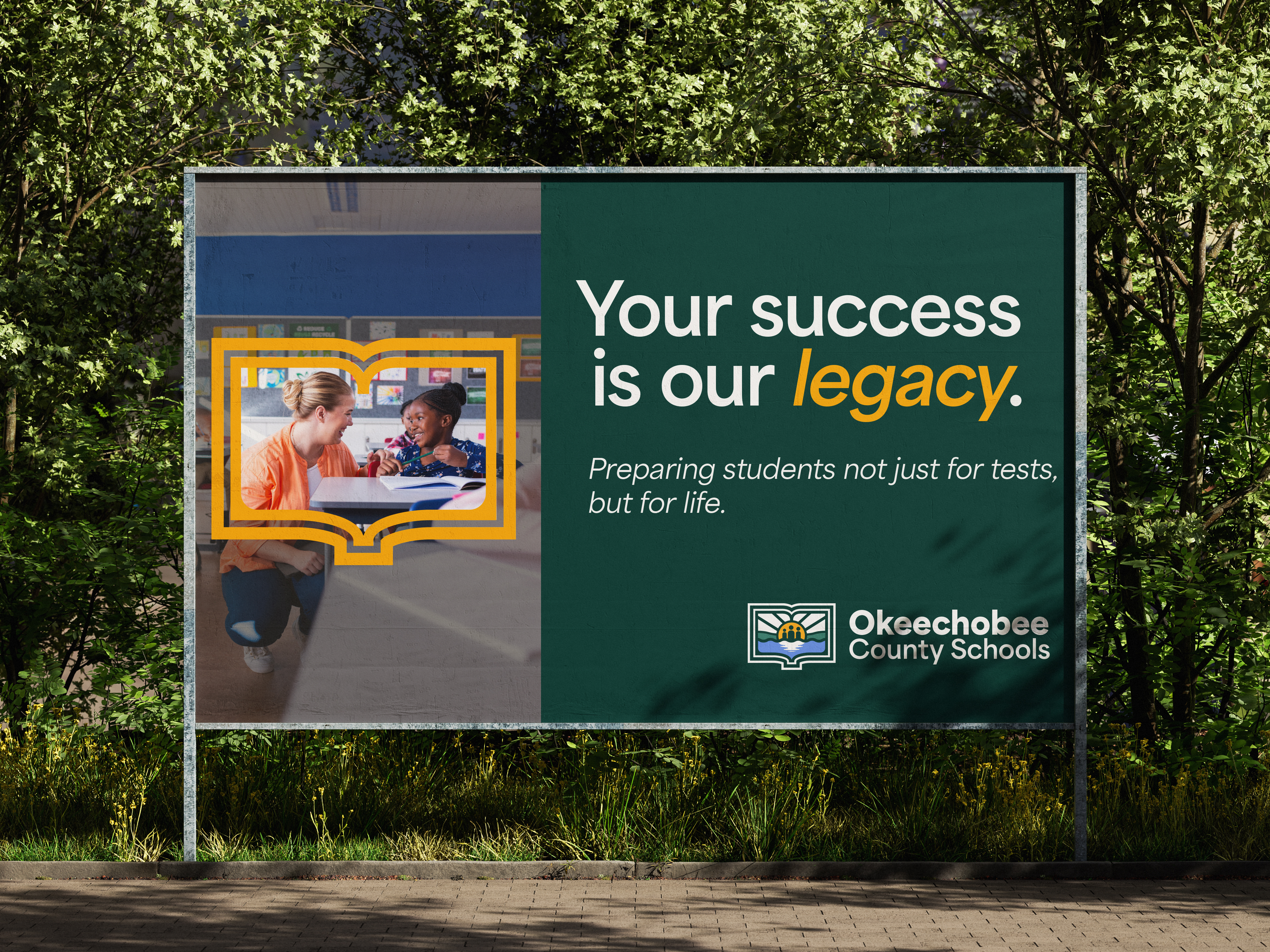
The final visual identity features a modernized book-shaped frame symbolizing education as the foundation of opportunity. Within the mark, a refined horizon line and rising sun represent growth and new beginnings, while three abstract silhouettes subtly reflect elementary, middle, and high school students to reinforce the district’s student-first focus. The surrounding landform references Lake Okeechobee and the region’s distinctive landscape. The logo system was engineered to function seamlessly across digital platforms, signage, merchandise, print materials, and large-scale applications.
Following logo approval, Rhodes Branding developed a comprehensive brand guide and full suite of templates to ensure consistent implementation across schools and departments. The district launched a coordinated brand rollout ahead of the 2026-27 school year, aligning its website, messaging, and marketing collateral.
This rebranding initiative positions Okeechobee County Schools with a cohesive, modern identity that reflects both its deep community roots and its commitment to preparing students for the future.